Yes, it's September. Yes, I have basically abandoned this blog. I'm writing short reviews on Goodreads, but I can't keep up with this anymore due to life circumstances. I'll probably write an official post about it in a while. But meanwhile, the Top-Ten Lists are just
so fun to do, that I can still manage to find the time and energy.
So here they are--in only approximate order--
favourite to least favourite, the best covers of the books I read in 2016. It was a bit of a disappointing lot this year. Not that there were lots of bad ones, just none that really struck me (unlike last year). (Note that I am not
in any way an artist or designer or anything, so these are based purely on what I like in book covers.)
Deep Secret. It's almost purely because of how much I love space. I LOVE space. Look at how that beautiful, beautiful space is outlined by an ordinary door, giving the impression that you never know when you'll open a door and come across GLORY. Plus there's a simplicity to this cover, and I generally like simplicity and a certain amount of minimalism.
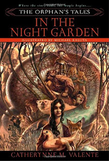
Although, speaking of simplicity, I like the cover for
In the Night Garden for completely the opposite reason. There's so much going on here. I kept referring back to the cover whenever I read a new story to see if I could find elements. And the art is beautiful too.
Vicious also has an illustrated cover, and I love it. The colouring, the blood, the striking human figure. I pretty much always hate people on covers when they're real live people (see
Truthwitch below for a surprising exception), but illustrated! Especially this well!
I love the cover for
Romeo and/or Juliet because it's hilarious and it suits the book so well. (I like it better than the cover for
To Be Or Not to Be actually, even though the illustrations inside that one are better.)
Wild Seed looks like an old-fashion scifi cover, which I normally don't like because of the colouring and busyness and weirdness. But this one fascinated me. Not sure why.
Not God's Type has books and a sword on it and it's teal, which is my favourite colour. What else can you ask for?
I don't loooove the cover for
Truthwitch, but I do like it a lot. That surprised me a lot because it's a live girl on the front with lots of CGI-type looking stuff, which is pretty much my least favourite type of cover (if you don't include bare-chested romance covers). But--I
do like it. Maybe it's the blue colour, maybe it's how everything is arranged, the shape of it.
Catch & Release has the type of simplicity/minimalism I love. Also the colour's nice. And those hooks! Eye-catching. Good stuff.
Runners Up (in No Particular Order): The Keeper of the Mist because it's just really pretty;
And All the Stars because the girl on the front actually suits the description in the book (that doesn't seem to happen often), plus it just looks kind of cool;
Ink and Bone because it's pretty too;
The Return of the Prodigal Son because that painting is fantastic, and the cover couldn't really be anything else;
Miss Pym Disposes because the whole feel of reading the book was so great, and this includes seeing the cover.
P.S. See also my previous lists:
2012,
2013,
2014,
2015.


No comments:
Post a Comment